用 AI 将 CSV 转换为交互式图表
CSV 文件是存储数据最简单的方式之一,但它们并不总是探索数据最简单的方式。
AI模型价格对比 | AI工具导航 | ONNX模型库 | Vibe Coding教程 | PLC在线仿真器 | Tripo 3D | Meshy AI | ElevenLabs | KlingAI | ArtSpace | Phot.AI | InVideo
你可以在 Excel 或 Google 表格中打开 CSV,手动选择列,选择图表类型,并调整可视化。这对于快速分析很有效。
但当你需要一个可以包含在真实产品中的界面时,这个过程就变得更加困难了。
Claude Code 可以帮助你将静态 CSV 文件转换为交互式数据可视化,而无需手动构建界面的每个部分。
在本文中,我将向你展示如何使用 Claude Code 在 4 个步骤中将 CSV 文件转换为交互式图表:
1、我们要构建什么
我们将构建一个销售收入图表。
想象一下,你有一个包含三个获取渠道每月销售数据的 CSV 文件:
month,channel,orders,revenue
2026-01,Organic,520,39100
2026-01,Paid Search,319,28200
2026-01,Email,252,18400
2026-01,Social,206,15800
2026-01,Referral,151,11700
2026-01,Affiliates,111,9600
2026-02,Organic,509,38700
我们想要创建一个界面,让用户可以:
- 查看总收入随时间的变化
- 按获取渠道筛选数据
- 使用工具提示检查确切值
- 在桌面和移动设备上使用图表
- 当文件为空或无效时显示有用的消息
提前为项目定义技术堆栈也很重要。在这个例子中,我将使用 Recharts,因为它提供了基于 SVG 的可重用 React 图表组件。
2、将 CSV 添加到你的项目
好的产品设计始于良好的组织。
我们需要做的第一件事是为数据创建一个专用文件夹。在我的情况下,我将在本地项目目录 'sales_dashboard' 中创建结构
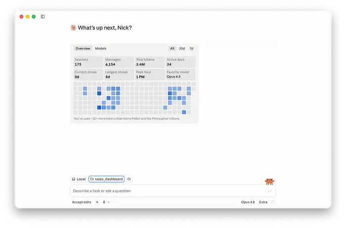
实际目录在开始时看起来像这样:你可以看到它只有一个 CSV 文件。
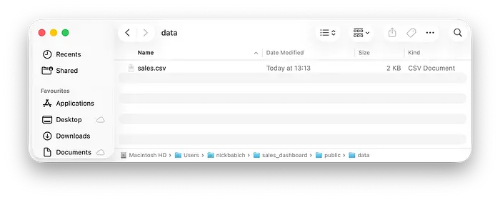
但最终的项目结构将如下所示:
sales-dashboard/
├── public/
│   └── data/
│       └── sales.csv
├── src/
│   └── RevenueChart.tsx
├── CLAUDE.md
└── package.json
因为 CSV 文件放在 public/data 内,这将允许我们的 Web 应用从 /data/sales.csv 加载它。
立即要求 Claude Code 创建图表是很诱人的,但这通常会导致平庸的结果并面临许多可以轻松避免的错误。
这就是为什么在编写代码之前,我要求 Claude 检查数据集。
我将使用以下提示进行初始分析:
Read public/data/sales.csv.

Do not write or modify any code yet.

Analyze the file and report:

1. The columns and likely data types
2. The number of valid rows
3. Missing, duplicated, or malformed values
4. The likely unit represented by each numeric column
5. The level of granularity represented by each row
6. Which chart types would be appropriate
7. Any assumptions that must be confirmed before implementation
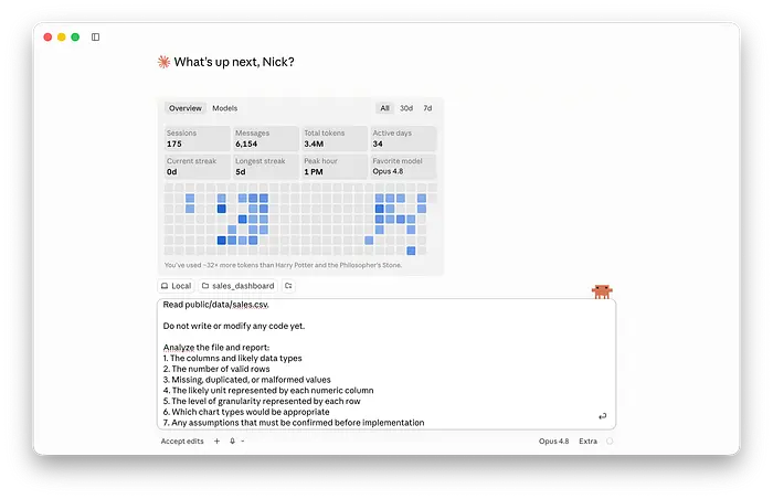
对于中等大小的 CSV,数据分析过程不需要很多 token,因此值得使用最强大的 AI 模型 Opus 4.8。但这个任务可以使用 Haiku 完成,输出质量几乎相同。
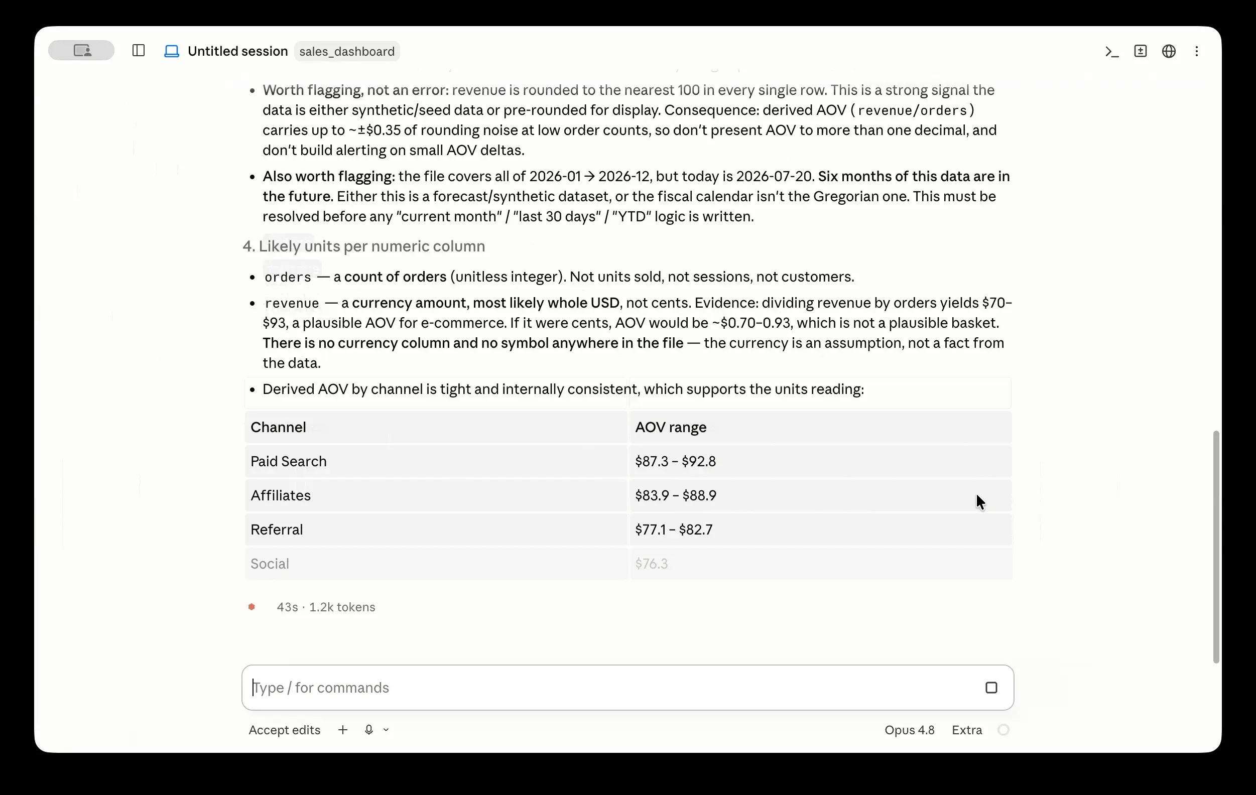
分析后,Claude 将识别源数据的任何问题或歧义(这将防止静默猜测)。在我的情况下,Claude 表示数据足够好可以使用(在最后一段中说明)。
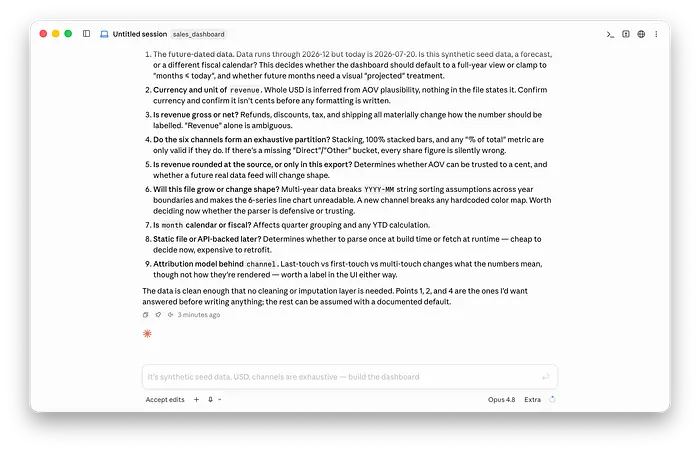
快速提示: 在要求 Claude Code 进行分析之前,记录数据的含义始终是一个好主意。例如,你可以添加一个 DATA.md markdown 文件来解释文件结构
# Sales data

Source file: `public/data/sales.csv`

Each row represents one acquisition channel during one calendar month.

## Columns

- `month`: Reporting month in YYYY-MM format
- `channel`: Customer acquisition channel
- `orders`: Number of completed orders
- `revenue`: Gross revenue in GBP

## Data rules

- Revenue should be summed when channels are combined.
- Orders should be summed when channels are combined.
- Missing values should not automatically be treated as zero.
- Rows with invalid month or channel values should be reported.
这为 Claude Code 提供了后续迭代的事实来源。
3、根据问题选择图表
你需要根据希望通过数据可视化实现的目标来选择图表。
不要仅仅因为图表看起来花哨就选择它。从可视化需要回答的问题开始。即使对于我在示例中使用的简单数据集,也有几个可能的问题,每个问题都导致特定类型的图表:
- 收入如何随时间变化?→ 折线图
- 哪个渠道产生最多的收入?→ 柱状图
- 每个渠道对月收入的贡献如何?→ 堆叠柱状图或面积图
- 确切的月度值是多少?→ 表格
- 订单量与收入相关吗?→ 散点图
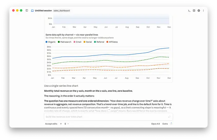
如果我的主要问题是:收入如何随时间变化?
我可能选择折线图,因为它将显示动态(趋势的方向和形状)。
快速提示: 如果你对要使用的图表有任何疑问,可以要求 Claude Code 为数据建议正确的图表。以下是我在这个例子中使用的提示
Don't edit anything

Analyze data and tell what chart I should use if I want to answer
the question "How does revenue change over time?"
Claude Code 建议为我的任务使用单系列折线图。它还使用我的 CSV 数据为这个图表创建了一个漂亮的预览。
4、要求 Claude Code 规划第一个图表
现在我们有了干净的数据并且确切地知道我们想要看到什么,我们可以要求 Claude 实现我们图表的第一个版本。
但为了充分利用 Claude Code,我们将切换到 Plan 模式并要求 Claude 为图表创建一个计划。
我将使用一个非常简单的提示来完成这个任务:
Create a line chart from /public/data/sales.csv
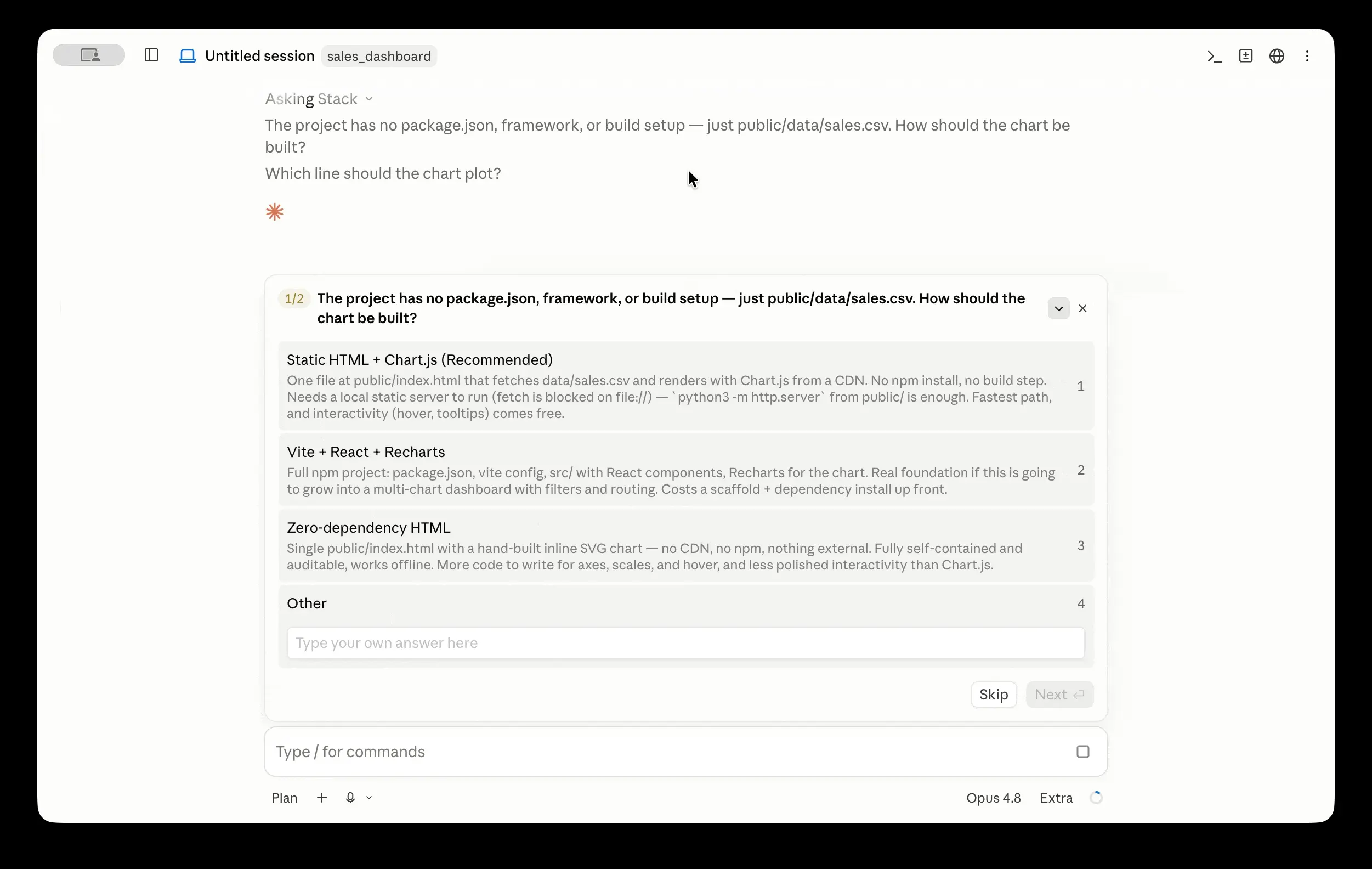
在这个过程结束时,Claude 将为图表生成一个非常详细的实现计划。
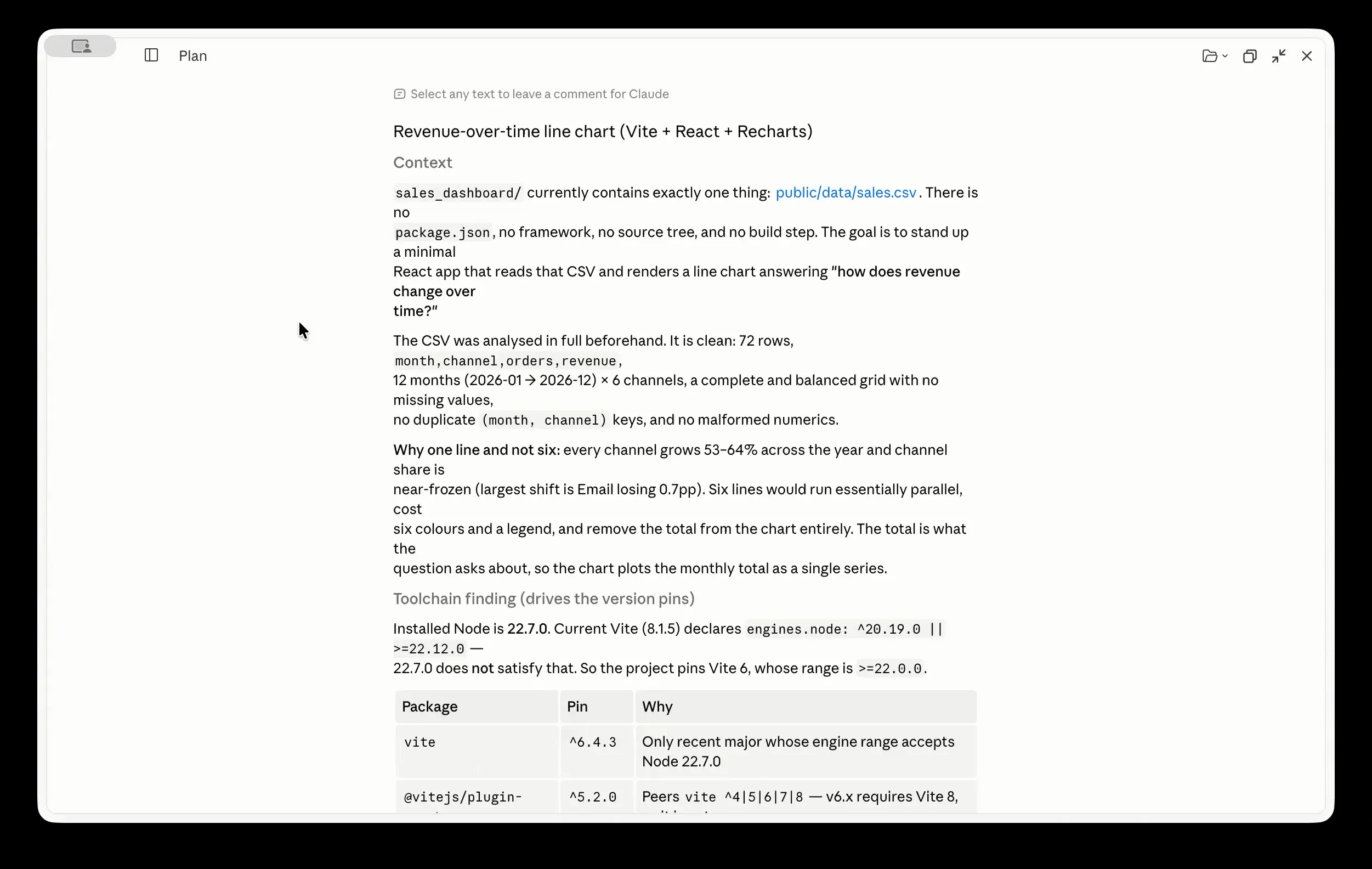
旁注: 你可能注意到 Claude 在制定计划时自己做了很多决定。为什么?因为我的 CLAUDE.md 是空的。你可以看到 Claude 在开始制定计划时就提前告诉了我们这一点。
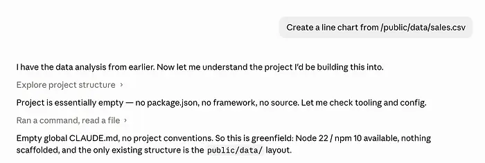
在 CLAUDE.md 文件中清楚地概述项目的重要要求始终是一个好主意,例如技术要求和验证循环。
Technical requirements:
- Use React and TypeScript.
- Use Recharts for the visualization.
- Use Papa Parse to parse the CSV.
- Create the chart in src/components/SalesChart.tsx.
- Do not hardcode the chart data in the component.
- Aggregate revenue by month across all channels.
- Sort months chronologically.
- Format revenue as GBP with no decimal places.
- Use ResponsiveContainer so the chart adapts to its parent.
- Add labelled axes and a tooltip.
- Use design tokens or existing CSS variables rather than arbitrary colors.
- Include loading, empty, and parsing-error states.
- Ignore invalid rows, but report how many rows were ignored.
 - Do not change unrelated files.

Before finishing:
1. Verify the January, February, and March totals against DATA.md.
2. Run the type checker and linter.
3. Report the files you changed and the commands you ran.
5、添加有用的交互性
一旦 Claude Code 提出计划,我们可以接受它并生成带有图表的实际 Web 应用。
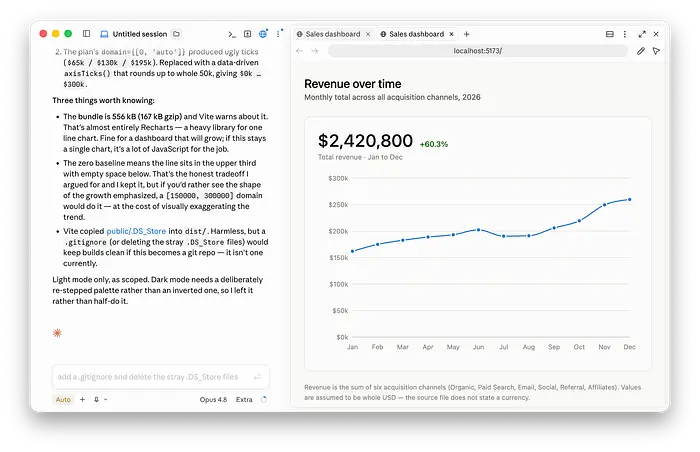
因为它是 Web 应用,我们可以在浏览器中打开它并与图表交互。
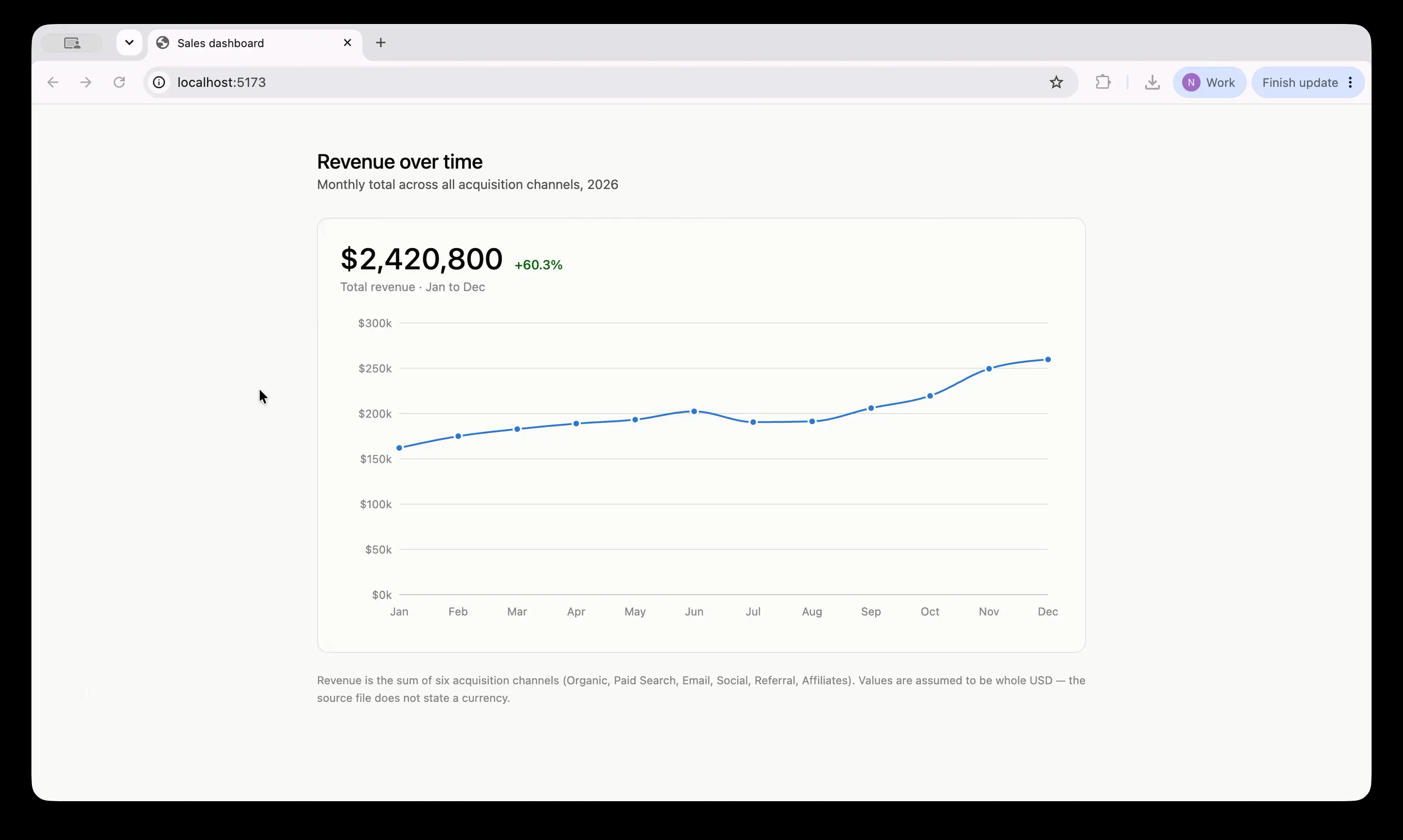
在这个步骤中,图表只包含基本的交互性(例如带有信息的悬停工具提示)。
但对于我们的销售图表,我们可以添加:
- 渠道筛选器
- 收入/订单指标选择器
- 日期范围选择器
- 与上期的比较
- 图表和表格视图之间的切换
- 包含收入、订单数量和平均订单价值的工具提示
我建议要求 Claude Code 逐步引入这些功能,而不是在一个大提示中请求所有功能。例如:
Update SalesChart so users can filter the chart by acquisition channel.

Requirements:
- Add an "All channels" option.
- Generate the channel options from the CSV rather than hardcoding them.
- Keep "All channels" selected by default.
- When one channel is selected, show only that channel's values.
- When all channels are selected, aggregate values by month.
- Preserve the current loading, error, and empty states.
- Make the control keyboard accessible.
- Do not change the data parsing logic unless required.
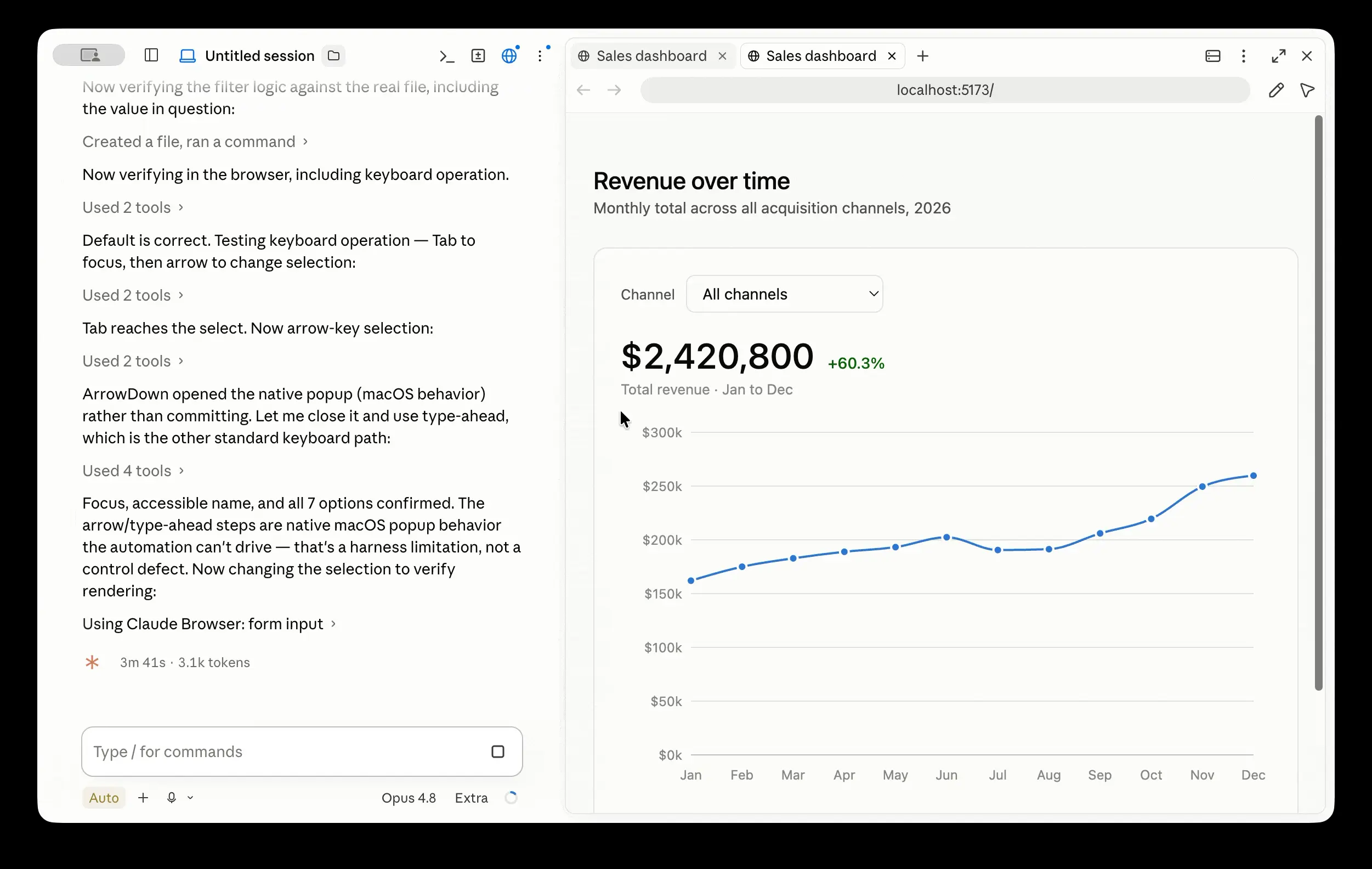
重要说明: 为 Claude Code 添加验证循环至关重要,以最小化 AI 在引入新更改时破坏我们设计的机会。你对"完成"的定义应包括数据验证。
我建议在 CLAUDE.md: 中使用最终验证检查
# Design validation process

After introducing any changes in data visualization,
verify the visualization before declaring the task complete.

Run the necessary checks and report the results.

Interface checks:
- Test loading, empty, and error states.
- Confirm that the chart fits a 320px-wide viewport.
- Confirm that every control can be used with a keyboard.
- Confirm that changing the metric updates the title, axis, and tooltip.
- Confirm that changing the channel updates the values.

Code checks:
- Run the type checker.
- Run the linter.
- Run relevant tests.
- Run a production build.

Do not say the task is complete if a check fails.
Report failed checks separately from passed checks.
原文链接: How to Turn a CSV into Interactive Charts with Claude Code
汇智网翻译整理,转载请标明出处